Art Deco illustration has a talent for arriving all at once. A figure, train, ship, city, or letterform takes command of the page, then a closer look reveals the measured shapes and small decisions that hold it together. That clarity is why the style still feels familiar in posters, book jackets, fashion images, advertising, and the visual language of great public buildings. To understand it, start with what the image asks you to notice first, then follow the route it creates for your eye.
See illustration as visual direction
An illustration does more than decorate a message. It decides how a viewer enters it. In Art Deco, a simplified profile, dramatic diagonal, or tower-like form often gives the eye an immediate place to land. The rest of the composition supports that first encounter through repeated lines, compressed space, carefully chosen color, and lettering that belongs to the image rather than sitting apart from it.
That visual direction is practical rather than mysterious. It helps a passerby understand where to look, what to remember, and which part of an idea deserves the longest pause.
This helps explain why the field is broader than a set of glamorous fashion drawings. Illustration appeared wherever a modern public needed to recognize an idea quickly: on travel posters, magazine covers, advertisements, book jackets, maps, menus, signs, and printed invitations. The Library of Congress’s Artist Posters collection preserves posters from the nineteenth century to the present and specifically identifies Art Deco among the graphic-design styles represented there. A poster may sell a journey or event, but it also teaches viewers how to imagine its mood.
Begin with the large shape
Before looking for period details, step back. What is the image’s largest, most decisive shape? It might be a streamlined vehicle, a standing figure, an arc of light, a distant skyline, or a bold field of type. Art Deco illustration often treats that shape as the composition’s anchor. It is simple enough to read from a street or station wall, yet strong enough to organize everything around it.
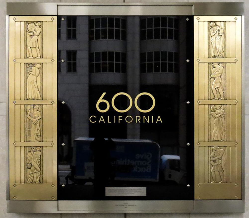
The same principle works in architecture. A person approaching a building first sees its overall silhouette and entrance, then discovers doors, carvings, lettering, and reliefs. The archive’s guide to Art Deco buildings follows this movement from large form to close detail. In illustration, the page performs a similar job: the first shape catches attention, then directs it toward smaller evidence.
Notice the geometry without turning it into a checklist
Art Deco is frequently reduced to zigzags, fans, and sunbursts. Those motifs can be useful clues, but they are not the style by themselves. The more important question is how lines, planes, and intervals create order. A curved form may be set against a hard vertical. A group of figures may repeat at a measured rhythm. A horizon may be compressed into stacked bands so that a train or ship feels unusually fast and sure.
That control can be quiet. A. M. Cassandre’s famous poster work used large forms and carefully integrated lettering to make commercial images feel monumental. The Metropolitan Museum of Art notes the dynamic Art Deco poster images associated with Cassandre, including Normandie, Nord Express, and Dubonnet, in its discussion of a major poster-design collection. The lasting lesson is not to copy those images. It is to see that proportion, contrast, and type can make a practical message feel composed rather than merely placed on a page.
Read lettering as part of the image
In ordinary reading, words and pictures can seem separate. Art Deco illustration often refuses that division. Lettering can establish scale, echo a building’s verticals, run along a curve, or create a visual rhythm that carries the viewer through the page. A title may be read as language and experienced as a shape at the same time.
This is one reason posters reward looking from more than one distance. From far away, the type may function almost like a block of color. Up close, its individual letters provide information, tone, and craft. The relationship is close to the way an inscription works on a facade: it has to identify a place while contributing to its visual character. At the archive’s Legendary Scribes, figures and lettering introduce the John Adams Building as a place concerned with writing and learning.
Follow the eye’s route through a poster
A good Art Deco illustration rarely asks the eye to wander at random. It sets a sequence. Perhaps a large figure leads to a hand, the hand to a product, and the product to a word. Perhaps a sharp diagonal carries the eye from a foreground vehicle toward a horizon. Perhaps a repeated border slows the viewer down before a central emblem takes over.
Try tracing that route with your finger, then ask what would happen if one major element disappeared. If the image loses its direction, you have probably found a structural element rather than a decoration. This method is especially useful when an image feels busy at first. Instead of naming every motif, look for the decisions that give it a hierarchy. The archive’s guide to Art Deco sculpture offers a companion approach for reading figures, reliefs, and entrances in three dimensions.
Compare an isolated image with its real setting
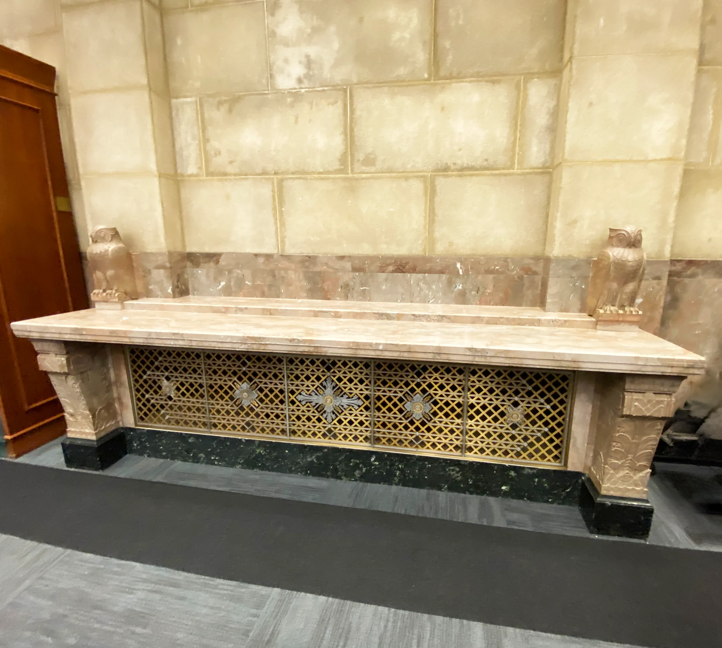
Many Art Deco images circulate today as cropped reproductions. A poster is removed from a station, a book cover from a shelf, or a decorative panel from its room. That can make the image easier to admire, but it can hide what it was meant to do. Scale, lighting, nearby objects, and the speed of a passing viewer all shape its meaning.
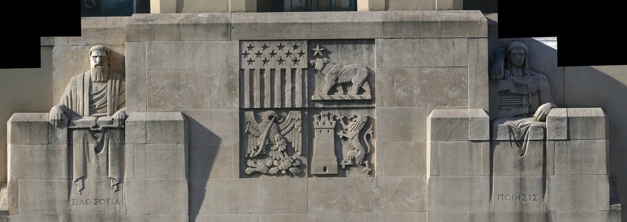
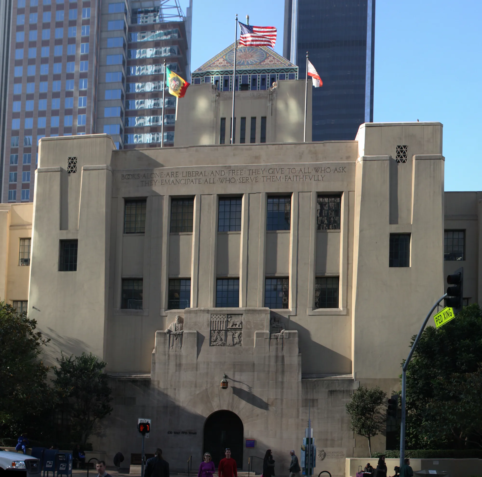
Public architecture is an especially good corrective. At the Los Angeles Central Public Library, figures, inscriptions, and ornament unfold across a visitor’s approach rather than appearing all at once. At the Nebraska State Capitol, Lawrie’s work carries themes across exterior and interior spaces. Neither is illustration in the printed sense, yet both show how visual form can prepare a person to understand a place. The point is not that every building is a poster. It is that pictures, surfaces, and symbols become more vivid when we ask how people actually encounter them.
Look for purpose behind the glamour
Art Deco’s polish can make it seem like a style of luxury alone. Many illustrations did advertise travel, consumer goods, fashion, or entertainment. But the same direct visual language also helped communicate public programs, civic events, exhibitions, and cultural ideas. The Library of Congress’s WPA Poster Collection, for example, contains more than 900 posters made between 1936 and 1943 to publicize community activities, theatrical productions, health, and educational programs.
Purpose changes how we read the image. A glamorous silhouette may invite a traveler to imagine speed and comfort. A public-service poster may use contrast and simplified figures to make a practical instruction memorable. In both cases, illustration works because it concentrates attention. This is a useful way to avoid treating Art Deco as a costume. The visual decisions matter because they make a message immediate, confident, and specific to its audience.
A five-step way to look at Art Deco illustration
- Find the first shape. Identify the figure, vehicle, letterform, horizon, or pattern that commands attention at a glance.
- Trace the eye’s route. Follow the composition from that first point to its secondary details and its message.
- Study the structure. Notice how geometry, repetition, contrast, and empty space create order without flattening the image.
- Read the type visually. Ask how lettering changes the composition’s rhythm, scale, and tone before reading every word.
- Restore the setting. Consider where the image was meant to be seen, how large it was, and what a viewer needed to understand in that moment.
This method makes room for differences between fashion drawing, commercial art, poster design, illustration, and architectural ornament. They are not interchangeable. Yet each can show how Art Deco used clarity and visual order to make ideas memorable. The more closely you look, the less useful it becomes to rely on a single motif or a short list of names.
Why Lee Lawrie’s archive is a useful next step
The Lee Lawrie Archive offers a way to move from a general style question into places where visual ideas had to work in public. Lawrie was a sculptor, not a poster artist, but his work at Rockefeller Center, the Library of Congress, and the Nebraska State Capitol shows how form, inscription, material, and symbol can guide a viewer’s attention. Start with the Lee Lawrie profile or explore the full works collection to see how that visual language changes with each site.
Readers interested in the complete relationship between art and architecture at the Capitol can continue with Prairie Deco. The book follows a single landmark through its great forms and its smallest details, which is exactly the kind of close looking that makes Art Deco illustration, sculpture, and architecture more rewarding.
Frequently asked questions
What makes an illustration Art Deco?
Art Deco illustration often uses simplified forms, strong geometric structure, controlled contrast, and lettering that works as part of the picture. The style is not a checklist of zigzags or sunbursts. Its stronger examples make an idea clear quickly, then reward a slower look.
Who were important Art Deco illustrators?
A. M. Cassandre is a central figure for posters such as Nord Express, Normandie, and Dubonnet. Erté is known for fashion illustration and theatrical design, while Jean Carlu brought a bold, modern language to posters. Their work shows how varied Art Deco illustration could be across advertising, fashion, travel, and public culture.
How is Art Deco illustration different from Art Nouveau?
Art Nouveau often favors flowing, organic lines and plant-like movement. Art Deco more often relies on simplified geometry, crisp contours, symmetry or controlled asymmetry, and a deliberate sense of modern order. Individual works can share influences, so the useful question is how the composition organizes attention.
Why do Art Deco posters still feel modern?
They often reduce a large idea to a direct visual structure: one commanding form, a limited palette, decisive lettering, and a clear route for the eye. That economy lets a poster remain legible at a distance while keeping enough detail to hold attention up close.
Related posts
 Art Deco
What Is an Art Deco Sculpture? How to Read It on a Building
Learn what makes a sculpture Art Deco, then use five clear ways to read figures, reliefs, doors, and details on a building.
 Art Deco
 Buildings: How to See What Makes Them Work
A practical guide to reading Art Deco buildings through their silhouettes, entrances, materials, and sculpture.
 Art Deco
Famous Art Deco Artists: 6 Ways to See the Style
Meet famous Art Deco artists, including Tamara de Lempicka, A. M. Cassandre, Erté, René Lalique, and Lee Lawrie.
Art DecoArt Deco Sculptors: How to Read Their Work
Learn how Art Deco sculptors used figure, material, symbol, and setting to make public buildings and everyday spaces speak.